
OVERVIEW
Over this 6 week-long project, we redesigned VELFARE's product page and its overall company goals in order to prepare the startup for its next stage of development as a new service in the market.
Team Members
Vatsalaa Jha, Christilda Santhosh, Sam Kwong (UI Designer)
About VELFARE:
Velfare is a soon-to-launch B2B SaaS marketplace for digital products and services. The platform features peer reviews, product details, and a professional network to assist professionals in making informed decisions about digital products and services and reducing post-purchase time, risk, and cost.
PROBLEM
How can we improve the current design of VELFARE’s product page?
VELFARE was in need of user experience research and user interface design. The company was at a very early stage of its development and had initiated website prototyping however, it needed actionable insights and design improvements, including competitive analysis, value propositions, wireframes, heuristics analysis, and prototypes.
ORIGINAL DESIGN
Let's examine the original design first and determine what modifications need to be done.

WEBSITE ELEMENTS
We have observed that before a product is purchased, 5 key sections are crucial.
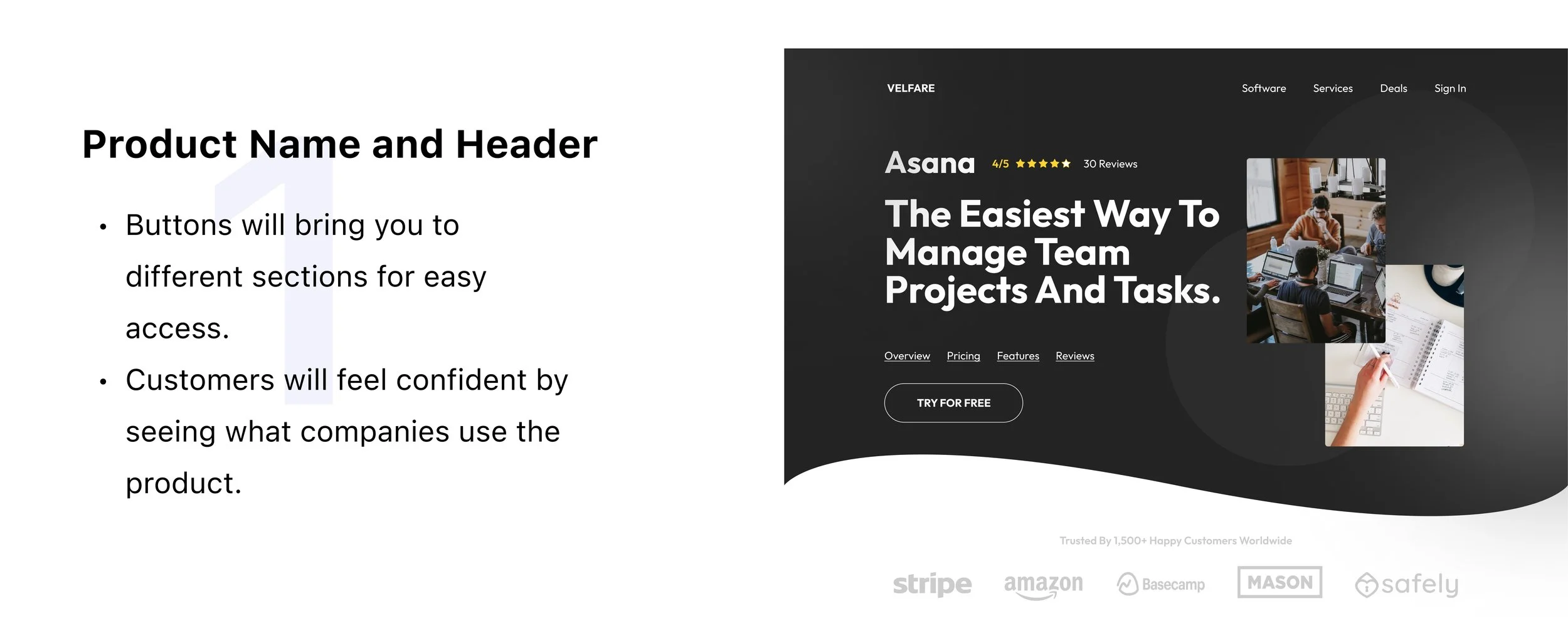
Product Name and Header
Overview
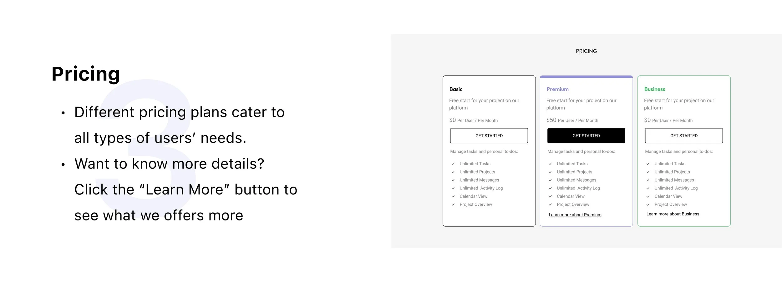
Pricing
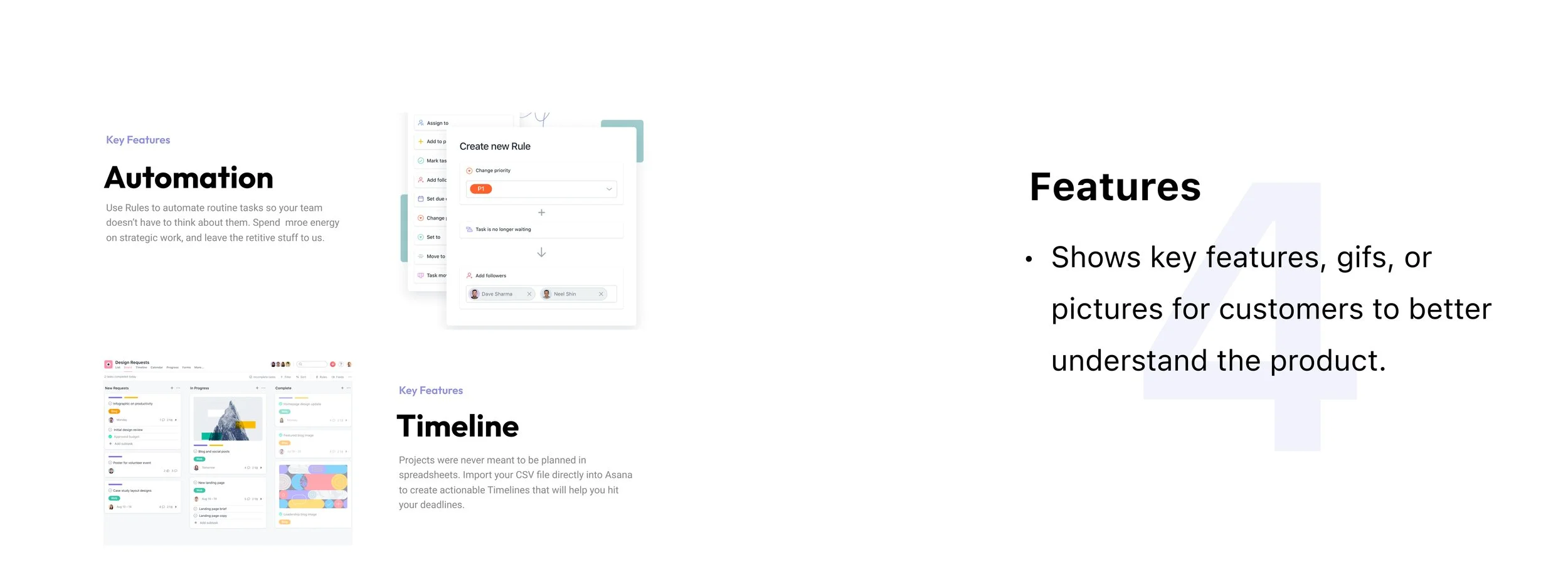
Features
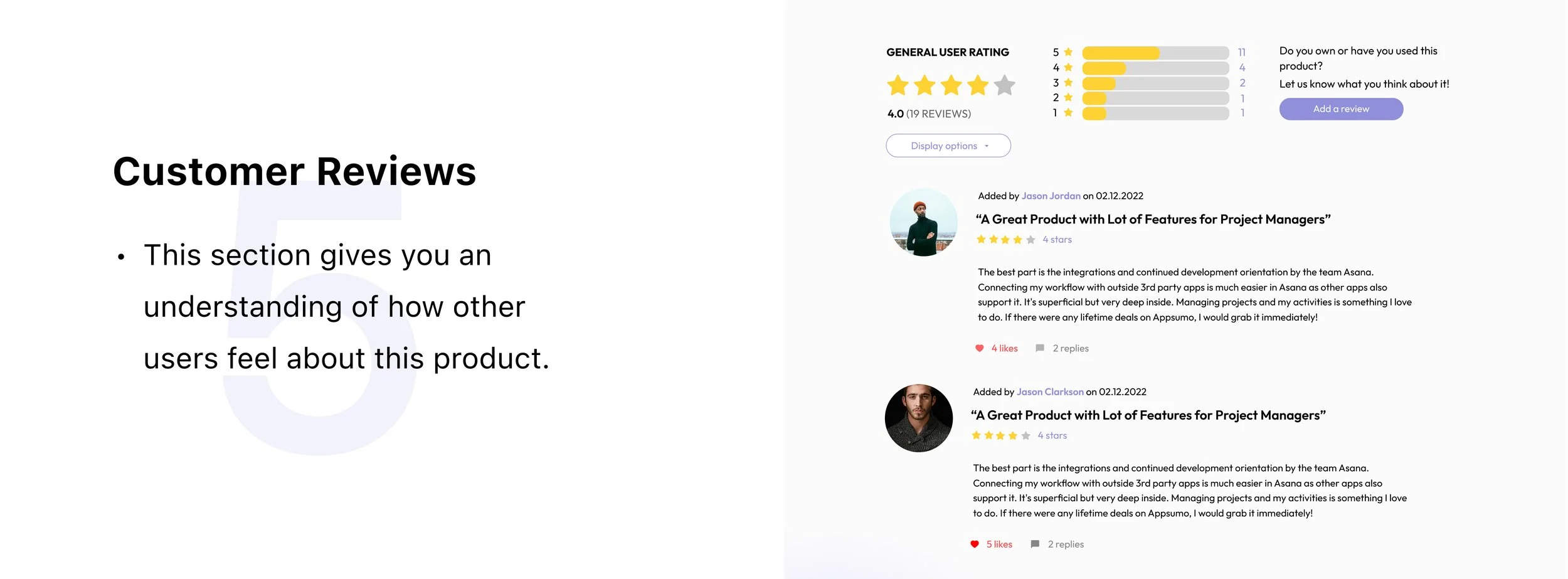
Reviews
FINAL DESIGN
We used Asana as an example to demonstrate the product page layout

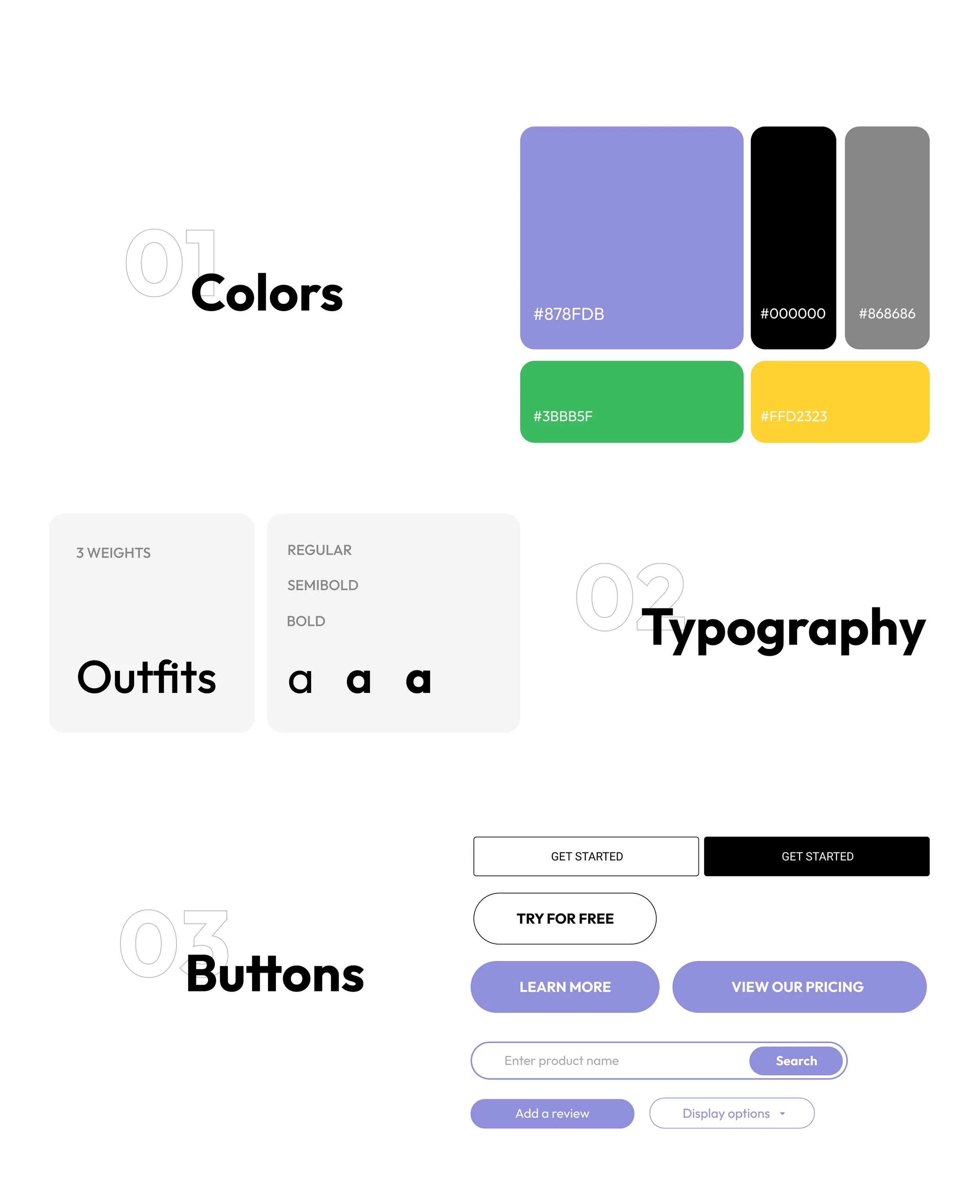
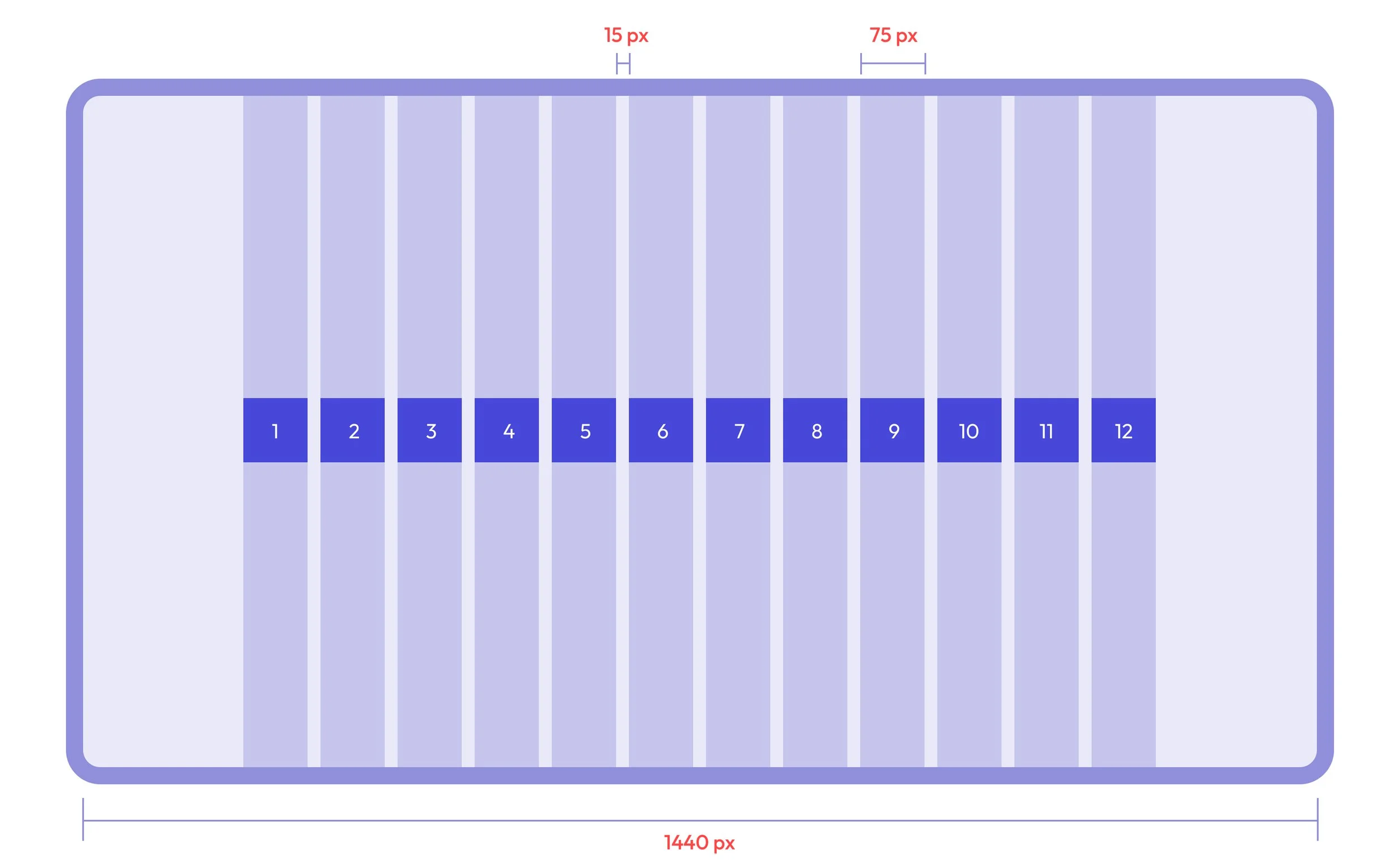
DESIGN SYSTEM
KEY TAKEAWAYS
The limitations of small start-ups
Small startups typically find it difficult to hire professional UX researchers due to high costs and time constraints. As a result, designers like myself try to meet the needs of the supervisors rather than those of the users. This often clashes with the assumptions of stakeholders who develop products. I realize that the assumption that the "users will want this" faces many risks after launch.